Sunday, May 20, 2018

Thing 12: Final Reflection


Silly as it is this picture pretty much sums it up.  Over the last two years, the Cool Tools PD has been consistently the best professional development that I've participated in.  I've struggled in the past to find professional development that both fits my needs thematically and fits my desired challenge level.  This PD has both, and I will jump at any opportunity to continue with it.

As a PD it has a really thoughtful, pedagogically cool design: it aims to create the educational landscape it promotes.  By having us explore independently and report our findings to the world, it is creating dozens of ambassadors for the digital transformation of education.

If there is anything that could be changed, I would love to see the PD demand more teamwork.  That may be a personal challenge, but I found that I didn't explore others blog posts or collaborate as much as I would have liked to.

This year I covered the following topics:
  • Bitmoji
  • Search Tools
  • Augmented and Virtual Reality
  • Browser Extensions
  • Digital Storytelling
  • News Literacy
  • Gameification
  • Productivity Tools
  • Digital Portfolios
Every single one of those will have an impact on how I teach next year, and many have made an impact so far.

Current Impacts:
First of all, as silly as it may seem, Bitmoji has filtered into my practice most fluidly.  I use it on a daily basis in presentations and in comments left for scholars.  It's a disarming way to get across attitude and mood, while expressing my personality into the classroom.  It even made it's way into my final evaluation with my supervising administrator.

Additionally, I have found that certain browser extensions have impacted my productivity significantly.  Having my to-do list pop up every time that I open a new tab has been incredibly useful.  I've used it as a planbook, mapping out my last few weeks of curriculum. 


The only shift I'm going to make in the coming days is whether or not I can make Workflowy replace this tab; the additional functions would amp up the power.  While in my initial post I talked about how Workflowy would not replace Outlook as my go-to productivity tool, if I can get it to fill the role of the new tab extension, it will create an impressive one-two punch.

Finally, I've experimented with the augmented reality; it certainly is a tool for flash and pizazz.  In my classes, Quiver motivated scholars to complete their work so that they could see their creations come to life.  I have also made my first HP Reveal AR Regents review document, with a modelled lesson popping up when students scan the first page.  I have yet to implement it, but I am excited to see how it transforms my class.

What's Next
A struggle that I had this year with the PD was that it seemed like every tool I explored would have been great... a month prior to exploring it.  I suppose that makes sense, however: I was clearly influenced by my brain being filled with fresh reflections of what went well (or didn't) in the prior unit. While I plan on implementing aspects of everything I explore the two that I'm most excited to implement are digital portfolios and gameification of the classroom.  In the last few weeks of school, I plan on piloting both with my classes and getting feedback from students about what works and doesn't work, that way I can avoid as many false starts as I can in the beginning of the year.

One of the best parts with this PD is the connections it makes with other work.  I'm currently in a Parent Engagement PD where we are searching for ways to encourage two way communication.  At the end of that PD, we are to design a plan for a capstone project, that we will implement at the beginning of next year.

My capstone project will be informed by both the Augmented Reality and Digital Portfolio activities.  It will be a site for the English Department, that acts as a portal to teach both teachers and families how to utilize these technology to engage in communication and scholar's education.

By connecting tutorial videos and/or mini lessons with homework assignments, parents will be able to empowered to be involved in their child's education.

By teaching scholars and families to utilize learning portfolios, scholars will be able to communicate about learning, not just grades, so that families can engage in more informed discussions about their scholar's education.

I'm excited, energized, and thankful for this year's experience.


Thing 34: Digital Portfolios

This is a topic near and dear to my heart.  Now it may seem like I've said that a lot, and well, I have.  But this time I mean it! (Actually I meant it all those other times too.  I'm officially rambling now).

In reading some of the articles, I found quotes hitting home a point that I constantly struggle with: how can we continue to get our scholars to view themselves as growing learners, not as fixed characters with a static set of skills.  I even heard one of my colleagues say this week, "ask me to write and it will never get done, put a math sheet in front of me and I'll do it all day - that's just the way I'm wired."  Perhaps I'm operating from a privileged perspective, but I've never experienced life that way; there are things that I'm comfortable with due to experience, and the only way to challenge that discomfort is through experience and practice.

It's that mindset we want to challenge with our scholars themselves.  As Renwick stated
digital portfolios give a chance to hold a mirror up to students so that they can SEE what they are capable of, and view learning as a process, not just a destination.  "As he saw himself with pencil in hand, she asked him questions such as, “How do you resemble a real writer in this image?” This focus on process, instead of a product alone, helped him build a better self-concept about his abilities and his persona as an authentic writer." 

Ferriter reinforced the shift that digital portfolios can help to happen: "They promote more reflective learners and help our schools to move from a culture of grading to a culture of feedback."  Ferriter went on to describe the difference between learning portfolios (demonstrating evidence of growth and progress over time) and showcase portfolios (showing student's best work).  Personally, I am most interested in exploring learning portfolios, as that challenges the fixed paradigm the most.

I looked predominantly at two tools: Google Sites and Seesaw.

Google Sites was my first click.  We are implementing Student Led Conferences at our school - something I am familiar with from my time at an Expeditionary Learning school.  Our district also utilizes Google Apps for School, so it makes sense to explore this as an option.  It clearly is a resource best used for slightly older students.  

Loves:

  • You can insert google documents directly into the webpages.  By having these embedded, you can see the evidence without having to click a link.  
  • There are a lot of customization options - image, video, graphics, charts.
  • Ease of use.  It acts as a linear stream but you can drag and drop components easily to arrange them in an order that makes sense.  It is also easy to make multiple pages, so you could categorize learning based on learning targets, topics, etc.
Bumps in the Road:
  • It is not actually a blog, so if you want to create a chronological stream you have to do it manually.  This means it is not naturally suited for a linear Learning blog.  It's still doable, but will require active maintenance, which can be problematic for students.

I recently heard one of my colleagues talking about the Seesaw app, so seeing it in the list of potential digital tools piqued my interest.  This tool seems more user friendly; much of the management side of things is on the teacher side, meaning there are less concerns about training students.

Loves:

  • Can use any media, pictures, .pdf, and it has google integration!  My colleague uses her phone to track student progress and add it to the stream.  This makes it...
  • Super easy to use and integrate into the day.  You don't necessarily have to set aside a "portfolio day" to contribute to the learning, whereas Google Sites would require much more formal time.
  • Naturally fits a learning portfolio format.  The stream is chronological. Also...
  • Family integration tools.  You can invite families to view their scholar's stream so that they can constantly be a part of viewing the scholar's learning progress.
  • Activity gallery - you can assign tasks right in the app for students to complete.  For example, filling out a graphic organizer with the most impactful learning activities for the year.  It shows up on their stream, and they are prompted to complete.
Bumps in the Road:
  • Some of the super useful tools are behind a pay wall.  The skill tracker in particular would be a great formative tool, but you have to pay $120 for the year in order to utilize it.

Hands down, I believe Seesaw has won the day for my purposes.  I could see a place for both, with the Seesaw app acting as the Learning Portfolio, and the Google Site acting as a Showcase Portfolio for SLCs.

Thing 47: Productivity Tools

I'm a believer in systems: one of my career goals in education is working to help the profession work smarter not harder.  My colleague put it well recently, there is a hero/martyr myth that is told about educators that harms the profession as a whole.  The educators we celebrate are those who make personal sacrifices, going above and beyond, dedicating time and personal funds in service of this "calling."

I recently attended my nieces graduation, where the principal lauded his AP's, specifically calling out how they were there at 5am every day before he got there, working diligently,  and were often there past 5pm each day for events, celebrations, and sports.  While clearly representative of the kind of passion we should strive to have in our profession, I view these kind of testimonials as a failure, not a success to celebrate.  Should a person have to work a 60 hour work week, sacrificing personal and family time to be a highly effective educator?  This, in combination with the recent high stakes accountability measures and budget cuts, makes me worry for the long term health of our education system.

Technology, to me, provides the tools to build systems to address efficiency and further education as a profession, developing it into something that is sustainable.  Productivity tools are a big part of that.

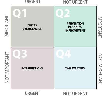
Prior to exploring this tool, I had explored the Microsoft Outlook suite to help manage my time, in conjunction with my reading of The Time Trap by Mackenzie and Nickerson.  This has been very useful, if time consuming.  If your organization runs using the Microsoft Suite, especially if your job requires collaboration, I would recommend Outlook as your daily productivity tool.  Using the quadrant system, you can create color coded labels to categorize the importance of incoming tasks, then using the flag system, you can set the timeline for completion. 

image credit Alex Czarto

By flagging these tasks, they appear beneath your Outlook calendar, you can then drag these tasks up to your calendar, blocking out specific times you will be working on said tasks. 


If those are shared tasks, you can right click on the task to assign it to someone else.  This automatically puts it on their task list, and you can track its completion in your own outlook, asking for periodic updates.

It is a powerful productivity tool, but it can be overwhelming.  In exploring this topic, I found a more informal tool that has some added benefits.

WorkFlowy

This tool is quite powerful and flexible.  It allows for task list generation in a simple format - if you know how to make billeted lists within any word processor, you are set.  Each bullet point acts as a mini menu, allowing you to share (through a unique link) copy, complete task (also ctrl+enter hotkey), add notes, etc.  By clicking on subheadings, you can zoom in, so that you only see the parts of the list that you want to at any time.


My favorite part is the inclusion of hashtags.  You can categorize tasks by topic (for instance, I labeled English 4 #E4 and #APLit for my AP class).  By clicking on that tag, you will zoom in on only tasks related to those classes.  This helps address the very real issue of trying to decide how to categorize your tasks; even though I placed the Refutation Paragraph task in my grading list, if I want to see everything that needs to be done for my APLit class, it's one click away.

This is the resource I would use if I only had teaching responsibilities.  If I'm dealing with scheduling meetings, collaborative tasks, recurring events, and/or receiving tasks frequently through email, I would have to stick with Microsoft Outlook due to its full integration with the calendar system.

****

As an aside - I am a fan of reader-view extensions.  Just Read is particularly full featured one.  Not only is it convenient for consumption, it helps address issues of printing out texts or resources for class!


Saturday, May 19, 2018

Thing 11: DIY - Gameification

One of the most intriguing things to me is the connection of gaming to education.  A lot of the positive feedback loops in gaming SHOULD exist within education as well: you learn not because you are told to, but because you want to achieve a goal.  You are rewarded not only by reaching the goal but by the journey: how it feels to be able to string together skills fluidly, the intrinsic feedback of a swish of a net on a basketball hoop, the adrenaline from competition and victory.

There are two resources that I explored in detail for this "Thing": the first is "ClassBadges"  It addresses two quandaries: how do we tap into intrinsic motivation? and how do we value the characteristics of a scholar we want to promote outside of summative grades?

During the RCSD Google Summit last year, I attended a PD about gameification that piqued my interest.  A science teacher presented on how they used badges to recognize accomplishments that wouldn't normally be indicated in GPA: lab minutes achieved, homework percentage turned in, citizenship (including advocating for others as well as contribution to the physical classroom environment).  This fit into the sweet spot, however, the work and effort that goes into this endeavor seemed prohibitive; this teacher manually made the badges, designing, laminating and handing out each to scholars.

Enter ClassBadges.  This *free* site allows users to create a class, design badges using stock images or custom art.  These obviously can be printed out physically, but the freedom of digital existence, particularly when utilizing Google classroom, opens up the possibilities.  Initially I plan on designing badges for the habits of work I have been tracking: Prepares for class, Engages in class, Demonstrates effort and perseverance.  However, I also want to expand to the particular mission goals that East has developed over the last two years: being tenacious, advocating for self and others, thinking purposefully.

This site acts as a good tack on system; it is not necessarily transformative.

In my exploration, I found a cool resource that integrates directly with google classroom, called Classcraft.  This site professes to transform your classroom into an RPG.  While I have concerns whether or not my students would find this "corny" it seems fairly fully featured.  The free version allows for positive reinforcement of behaviors (think PBIS behaviors: answering questions correctly helping others, arriving on time) as well as providing immediate consequences for negative behavior.
Different character classes have different abilities, so scholars can self select based on what they know about themselves.  Warriors have higher HP but fewer abilities, meaning that there is more leeway for making mistakes in class for those who may suffer from a lack of focus, but there is less possibility for using skills that allow for hints, cheat-sheets, privileges (choosing your own seat, leaving the classroom for up to 5 minutes, turning in assignments late without penalty)  or use of notes during assessments.  Mages have fewer hit points, but more ability points to use on said privileges for yourself or others.

Which brings me to the other potential benefit: collaboration.  Classcraft allows for customization of both individual characters and teams.  Teams can receive boons and punishments based on the actions of the group, building in a kind of responsibility and accountability that can help nourish a healthy classroom environment that is about community, not just about the individual.  That student who focuses with easy and is difficult to distract is not characterized as a teacher's pet, but as an asset who can benefit the whole team.  Responsibility for others is a quality that is undervalued in our individualistic society.  These teams can and *should* be organized thoughtfully.  My bias is towards a heterogeneous organization, using data such as SRI or pre-assessments to ensure that no team is stacked.  My bias is also to have team leaders selected by leadership qualities outside of academic skill.

I'm excited to continue exploring this idea moving into next year.  I feel like I've taken a seed and now have a sprout.

Thing 21: News Literacy

Copyright holder: SparkCBC 

The reality is, news literacy is becoming more and more essential.  I definitely connected this to my readings of Lankshear and Knobel’s "Digital Literacies" where they postulate that we have shifted from an information economy, where the scarce resource is access to information, into an attention economy, where the scarce resource is people's capacity to consume information.  The primary readings for this topic did a good job of summing up the critical issues with this shift: the goal of media is not necessarily getting the most accurate and up to the date information, it is to get a reader's attention.  We've seen the result: click-bait (ambiguous or misleading headlines or images), sensationalism, flash over substance, and, perhaps most concerning, the embrace of bias as a means to maintain an audience.

Media seems to be tapping into people's confirmation bias as a marketing tool.  News sources that remain objective are uninteresting.  Now front pages of journalistic sites put editorial next to factual news, passing opinion off as analysis, implying equal journalistic merit.  Punditry has replaced journalistic distance, and while reporters used to be criticized for breaking the unspoken rules of impartiality, now a reporter who does not have a viewpoint is seen as being out of touch.

But I digress.

I valued the framework that was set up by the John Spencer, looking at the 5 C's of media literacy: (as an aside, I'll save you some time: don't bother signing up to download the resources off his website.  It is a scant word document that is less useful than the questions listed below... just use them to make your own graphic organizer - crediting him of course!)

#1: Context – Look at the context of the article. When was it written? Where does it come from? Have the events changed since then? Is there any new information that could change your perspective?

#2: Credibility – Check the credibility of the source. Does the site have a reputation for journalistic integrity? Does the author cite credible sources? Or is it satirical? Is it on a list of fake news sites? Is it actually an advertisement posing as a real news story?

#3: Construction. Analyze the construction of the article. What is the bias? Are there any loaded words? Any propaganda techniques? Any omissions that you should look out for? Can you distinguish between the facts and opinions? Or is it simply all speculation?

#4: Corroboration: Corroborate the information with other credible news sources. Make sure it’s not the only source making the claim. If it is, there’s a good chance it’s actually not true.

#5: Compare: Compare it to other news sources to get different perspectives. Find other credible sources from other areas of the ideological or political spectrum to provide nuance and get a bigger picture of what’s actually happening.

I found that the remainder of my exploration was shaped by those four ideas.

AllSides: The most useful tool I explored.  The ability to see an outlet's supposed bias, and get articles on the same topic grouped together easily will enable the meat of critical literacy skill-building.  Begin by having students go directly to the site and examine a topic from multiple sources, writing down phrases, sources, and diction that indicate bias; then give them text without source listed to see if they can detect bias alone.  Or simply use it as a corroboration site, where scholars can check outside sources against the ones listed here.

Factitious: Useful in proving the difficulty of identifying real and fake news, but beyond that can be misleading.  There aren't the actual tools to go through the 5C's and so it just becomes  a guessing game (especially since many of the "real" news stories are reporting on farcical or outrageous events).  Maybe use as a hook at the beginning of the year to introduce the concept of media literacy?

NewsELA: I've used this before and love the ability to scale a source to the reading level of scholars.  This is useful because in order to be able to have media literacy, you have to be fluent in the language being used.  It's difficult to detect bias if you are unable to understand the connotative shades that color the diction used.

News Explorer: Want to feel like you're on CSI or in the movie Minority Report?  News explorer is the app for you.  Seriously though, it's visualization technique looks like something a sci-fi writer imagined the internet would look like 50 years in the future.  Unfortunately, like those unrealistic depictions, the practicality of this engine is questionable.  A link of E3 (electronic entertainment expo) and Super Smash Bros. Melee came up with 65 articles, only a handful of which actually had to do with both topics.

Wednesday, May 16, 2018

Thing 4: Digital Storytelling

Schools have gotten away from the power of storytelling.  With the emphasis on high stakes testing, evidence based writing and textual complexity have often dominated the discourse, leaving behind artistry, craft, and expression.


At my school we are beginning to notice the impact of this shift in focus.  Item analysis shows that students, in addition to continue to struggle in writing about analysis, are struggling with questions about author's purpose and craft.  Words like "impact," "effect," and "purpose" are causing confusion as students most frequent interaction with text is as consumers seeking answers.


In exploring this "Thing" I found myself being drawn back into the mindset of teaching students to be explorers seeking to experience text, seek out every nook and cranny of possibility, and learn to not just consume but express and share their understandings.


That is the power of Digital Storytelling: it asks students to not just consume, but express, and provides outlets to look at the more subjective intent and experience of reading.


I find myself thinking about the action research I read about in "You Gotta Be the Book" by Jeffrey Wilhelm.  He explores what highly engaged readers DO as they read, and found that they CREATE a secondary world within their head that lives outside the pages of the book.  This secondary world contains all the possibilities, imagination, subtext, emotional connection, and is unique to individuals.  Ultimately, every author's goal is to create that secondary world, so we need to aid students in their journey to experience it and express it.


That's where I see digital story telling fitting in:  Construct a illustration of a character's journey; or of how a central idea about power was developed chronologically in a story, or of how the author characterizes an individual.  Add music, pictures, and words that each have an explicit purpose or contribute to this understanding.   Make the students justify their selection of each picture (and thus experience what it is like to be an author yourself, opening the lid on the mystery of author's purpose).


I've used Windows Movie Maker and iMovie in the past for these efforts, but the technological barriers meant the projects took longer than what was desirable.  I explored a few of the sites;


The Winners


Steller


It was interesting and easy to use on the phone, and would be desirable for field work and/or home work assignments.  In school it may be less desirable: there are fewer features, it relies on your photo library on your phone, and requires students to be on their phones, which may be against the rules in some schools, or may introduce management issues.  For quick projects or projects on the run, this makes content creation easy.


Adobe Spark


By far my favorite, this takes the strengths of movie maker (the ability to merge all kinds of media: image, text, video, music) while having a web interface.  I was also impressed with the suggested template system.  I tested it using the topic we are currently covering in my English IV class: tracking the development of the central ideas of identity and power in Gogol's "The Overcoat."  By typing in some key words it automatically suggested a series of templates that could be related, including hero's journey, character development, rise and fall.  It seems well supported by video tutorials and samples.  I will be using this in the future!


The Also-Rans

I explored these tools, but they were not exactly what I was looking for, and didn't really blow my mind.

Photopeach

Cool interface, and I liked the fact that there were a couple cool unique features: users can leave comments that are appended onto the end of the show; you can integrate multiple choice quizzes into the slideshow.  I couldn't see a way to tally or record the results, so that latter feature seemed more gimmicky than useful, thought it could develop into a more full fledged resource later on.

Sharalike

This site had music, photo, and transitions. It WAS simple to use.  Unfortunately, it seemed as though the text options were limited, which is a big deal for my purposes.


Thursday, May 10, 2018

Thing 41: Power Up Your Browser

I've played with extensions before, but this activity helped me flex a bit more.  I've grouped my experience in a few categories:


Quality of Life:


AdBlocker - I can't live without it.  It takes care of inappropriate ads and pop ups that may bug you throughout the school day.  It even takes care of most ads during videos.  It's worth noting that turning it off for a website that you care about is the polite thing to do, as they use the revenue from ads to produce their content free of charge.


Google Calendar - I didn't know what I was missing out on.  The ability to check my calendar or add events without navigating to a new website or pulling out a phone is amazing!  This is especially helpful if you use google calendar to keep track of assignments (like in Classroom) or lesson plans!


New Tab Draft - pro-tip - read the comments on education sites (and recipe sites).  Unlike many sites which are normally populated by inhuman trolls, these sites often have the best suggestions and advice!  That's where I found this awesome tool.  It turns your "new tab" button into a place to keep track of notes, to do lists, and synthesize thoughts.  It completely changes the way I interact with my browser.  Rather than staring at inane website suggestions, I can use that blank space to gather my thoughts and make connections between the million things that are going on in my brain all day.


Content and Instructional Tools:


formRanger - I hope it's not cheating, but I found this before I started this activity.  If you create a lot of forms, or collaborate on them, or are in charge of organizing any organization wide document, this is a FANTASTIC way to manage the lists within a google form.  I manage many systems within my school that require documentation of staff members and students (parent contact logs, disciplinary referrals, walkthroughs, SPED contact minutes), this add-on allows me to pull the information for the drop downs in one google sheet.  New student?  New staff member?  Update the list, and every form reflects the changes.  Priceless.  (You can also get fancy and use this to limit entries; i.e. if you want to use a form to have people sign up for a certain PD offerings, you can have the choices automatically disappear after a seat-limit has been reached)


DocTools - This was more useful when they had the "highlight" option in the same menu as change text; but this is a great tool to use with students that allows them to quickly access the kinds of tools useful for annotation of text digitally.  I have my students do quite a bit of reading on their chromebooks and this enables that process.  It also adds interesting editing functionality, like the ability to sort lists, change numbers to words and words to numbers, and mess with capitalization.


Awesome Screenshot - When paired with HP Reveal this is an explosion of heavenly possibility.  I just wrote about how "awesome" AR is in flipping the classroom.  Awesome Screenshot and it's screen casting capabilities just enhances those possibilities.


Not Really A Browser Extension but...


Spritzlet: http://www.spritzlet.com/
A literacy teacher in my building shared this with me.  It is a speed reading tool; you highlight a section of text, and it automatically shows one word at a time at the perfect position for your eyes to read without moving.  You can adjust the speed at which the words show up, up to 450 WPM without an account and up to 1000 WPM with an account.  For students who are having difficulty following the text, or who need to improve their fluency in reading, this is a tool that can help scaffold their learning.